|
Food ProjectReflection
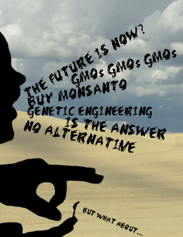
1) I chose to make a photoshop poster for several reasons. First of all, it would be the easiest to incorporate all the elements that I wanted to include, like the scratchy font and the flicking silhouette. Those would be extremely hard to incorporate into a photo without having a professional setup and the ideal location. Also, it is the medium that I have the most experience in, so I knew that I could make a beautiful piece of work, where as my painting skills are questionable. 2) I had to use many elements and principles of art during this project. First of all, I used contrast to make the Agribusiness giant and the small, organic farmer stand out. I also used line in the text to make it look kinda bleak and sketchy. The last principle I used was movement. I made it so that the viewer's eye first goes to the giant, to symbolize how most people see only one solution to the food crisis. Because the last thing you see is the little man representing alternative methods, it is showing how very few people see alternative methods to feeding the world, other than GMO's. 3) If I were to redo this project I would procrastinate less. Although I am happy with my final product, I could have been a lot less stressed if I had started earlier on my essay and photoshop poster. I think that I chose the right topic though, because I am very interested in the future and seeing what improvements we are making in agricultural technology. |
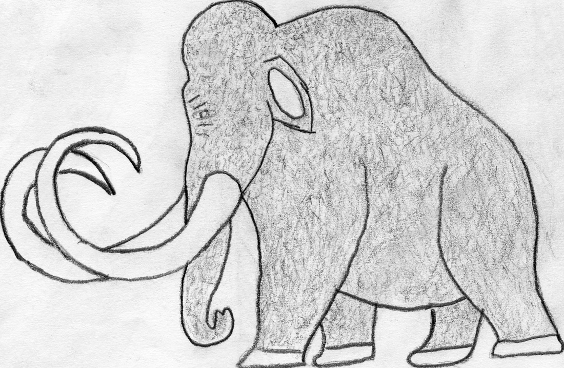
The birth of artDuring this project we studied an art from the paleolithic, mesolithic, and neolithic eras. We covered everything from the earliest cave paintings and relief sculptures to the gigantic Egyptian pyramids. We also did two mini-projects in this unit, a drawing of a prehistoric animal such as the mammoth to the right, and a brochure on an ancient artifact. For the brochure, we had to learn the program Adobe Indesign and for the drawing we had to learn Adobe Illustrator to trace our drawing in different ways.
|
Lighting and Depth of field Mini ProjectFor this project we had to demonstrate our knowledge of lighting techniques and depth of field by taking photos that clearly showed both of the concepts. The size of your camera's aperture determines whether the depth of field will be shallow or wide. A shallow depth of field (f 1.8-f 5.6) means that the foreground or background will be blurry based on where you focused the camera. This is used to emphasize a certain part of the picture. A wide depth of field (f 12 and up) means that the whole photo will be crisp and in focus. For the lighting side we tried to take photos with the four main types of light-hard, soft, reflected, and transmitted
|
STop Motion animationFor this project, we made a stop motion animation in adobe flash. We learned all the flash basics, such as motion tweens, shape tweens, and the use of keyframes. We also had to demonstrate our knowledge of the rules of photo composition, such as the rule of thirds and depth of field. The size of your camera's aperture determines whether the depth of field will be shallow or wide. A shallow depth of field (f 1.8-f 5.6) means that the foreground or background will be blurry based on where you focused the camera. This is used to emphasize a certain part of the picture. A wide depth of field (f 12 and up) means that the whole photo will be crisp and in focus.
|
|
Book cover project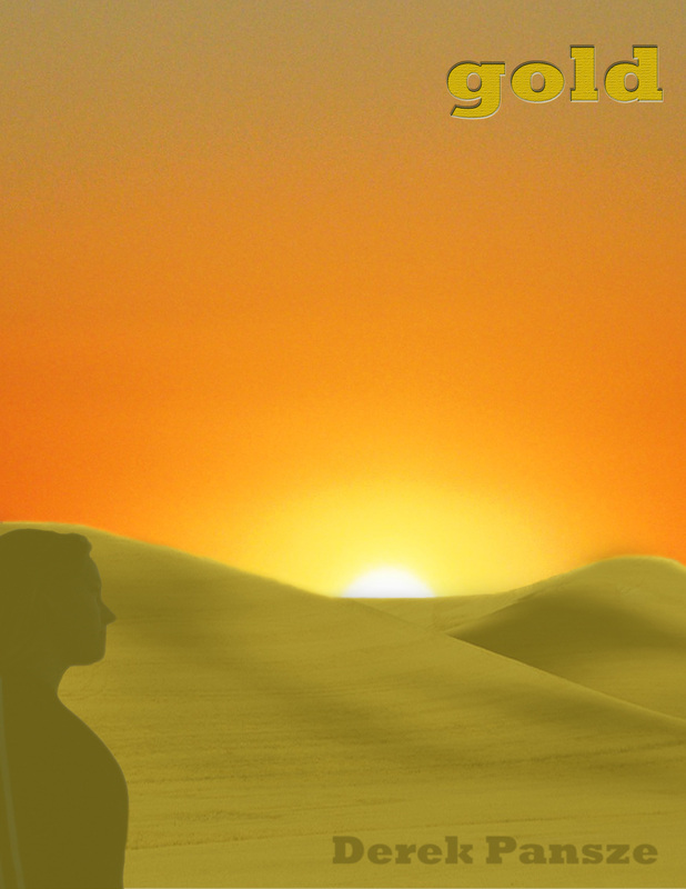
This project was a joint project for two classes. First, we wrote a short story in humanities. Then, we designed a book cover for our short story. My book cover went through multiple revisions. First, we drew a rough draft in our sketchbooks. Then, we started to put them together in photoshop. Also, I made many small tweaks to this project, such as changing the silhouette in the foreground and adding a gold overlay to the hills. One thing i would change about this project would be to refine the edge of the hills a little more to make the edge look more professional.
Essential Questions 1)What makes for an engaging book cover? An engaging book cover is one that attracts potential customers. An artist could do this in many different ways. One way to attract customers is to appeal to their emotions. As our teacher told us, a good book cover always evokes a feeling. You can convey a feeling or an emotion through color, such as using a dark overlay to convey a feeling of sadness or despair. Another way you could impart a feeling on a potential buyer would be to add texture or roughness to the cover to convey a rough-and-tumble kind of feeling. 2)How and why is art used as a vehicle for communication? Art is used as a vehicle for communication because it is the 'universal language'. While not everyone can understand Spanish or German (or any language for that matter), most people can look at a piece of art and understand the artist's intent when crafting the piece. Also, art can be used to tell stories through a series of pictures. This is useful because anyone can understand a series of pictures that convey a story or a feeling. 3)To what extent does a work of art depend on the viewer's point of view? The viewer's point of view has everything to do with how they interpret the piece. Their previous experiences dictate how they view each piece. For example, someone who enjoys nature and going on hikes will most likely enjoy a painting of the mountains because they can connect with it. When designing a book cover, you will want to make sure your piece appeals to the potential customers. For example, you will want to market a book about teddy bears to younger children and not adults because then you wouldn't sell any copies. |
Teacher-animal poster project
For this project we used Photoshop to put a teacher's face on either another person or an animal. I chose to put Dave Heerschap's face on the man from River Monsters, Jeremy Wade, as he was holding a giant fish. I then selected a background from google images. After that, I added small details such as the eagle, the secret face(see if you can find), and my name(in the log over on the right). To make my name, I used the text selection tool and then copied the selection. Then, I repasted my selection in a new layer. After that, I used a special layer overlay to alter the color of my name.
This was one of my favorite projects because we got to be very creative yet it still tested our Photoshop knowledge. One thing I would change about my project would be to fix the left side of Dave's neck where it meets the shirt because it overlaps too much. Another thing I would change would be to make my name bigger because it is pretty hard to read. Overall, this project was very fun but if we had more time I would have been able to refine it more and make it very professional. Photoshop tutorials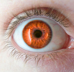
Watching videos really helps me learn things and understand them better so I was very excited when I heard that we were doing a project that involved us watching tutorials to do assorted things in Photoshop. I made multiple pieces during this project but my favorite was the one above. That eye was originally blue but I was able to manipulate it to change it to orange.
This project was cool because we got to chose subjects that interested us so none of them turned out the same. Also, it helps people who are like me that learn well by watching videos. Other things I did during this project include: changing hair color, making vampire teeth out of a normal set, and creating 3-D pieces in photoshop. |
